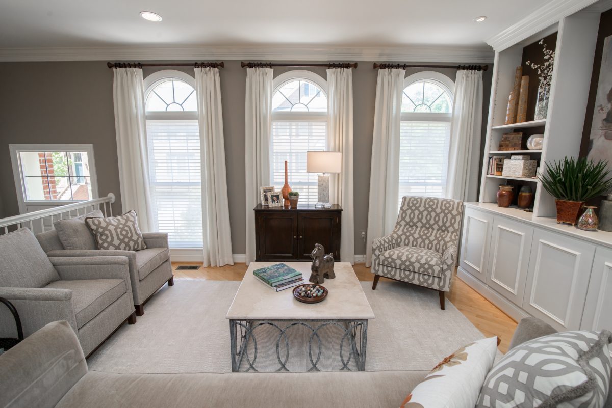
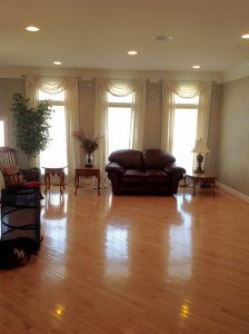
The original Living Room space was outdated with it’s old faux sponge painted walls, window treatments, and lack of a cohesive conversation area. The furniture was against the walls and the colors on the walls and of the floors did not compliment each other.
Our starting point was with a floor plan to create the ideal conversation area. As a focal point, we created a built in wall unit and painted the wall behind it dark brown for an extra pop. The wall unit was made with an opening in the middle for a large contemporary picture with great colors. That was the idea that got us going, from this artwork we began to build out the color scheme all while keeping the color of the flooring in mind.
The client’s need was for a functional space, her desires were for an updated an clean look. By painting all the trim, including the bookcases, in a soft white and choosing paint and fabrics with varying degrees of taupe in them, we were able to create that look. We stuck to that color scheme but used patterns and textures through the fabrics while knowing that other pieces in the room would create a balance.
We added height to the room by dressing the windows with simple, off white linen panels to elongate them and show off the beautiful arched detail at the top. A dark wood chest was placed to anchor the room while the light stone coffee table with a metal base added additional interest and broke up all the wood in the room. Finally we pulled the more vibrant colors from the artwork into the room through decorative pieces like accessories, lamps, and pillows which completed the look and tied it all together.
Before
Have a design project of your own? Give us a call at 301.360.0680. Our talented staff of designers can help you every step of the way!
See our portfolio on Houzz!


